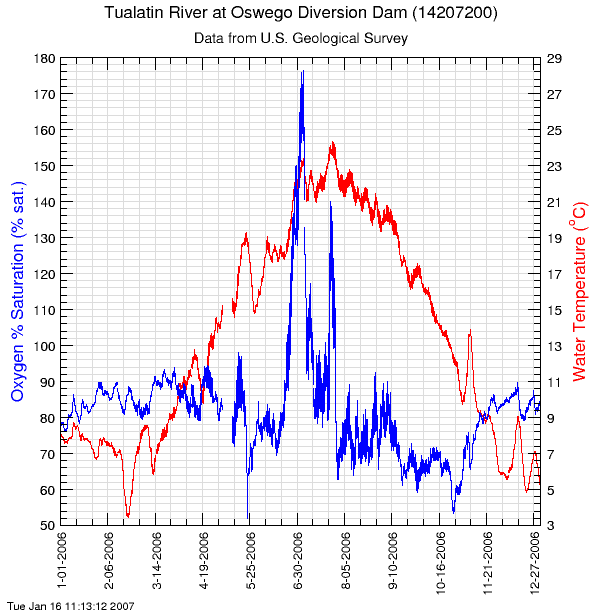
The Data Grapher can plot one or two time-series datasets from a single site, either as a time-series graph or an XY graph. Here is an example of a time-series graph of oxygen percent saturation and water temperature from a site in Oregon:
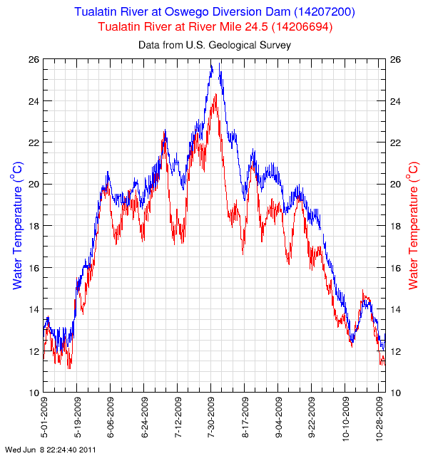
The Two-Site Data Grapher can plot two time-series datasets (time-series or XY graphs); the datasets need not be from the same site. Here is an example of a time-series graph of water temperature from two sites on the same river system in Oregon:
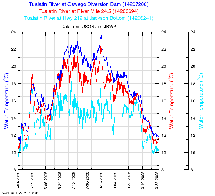
The Three-Site Data Grapher can plot three time-series datasets from the same or different sites. Here is an example of a time-series graph of water temperature from three sites on the same river system in Oregon:
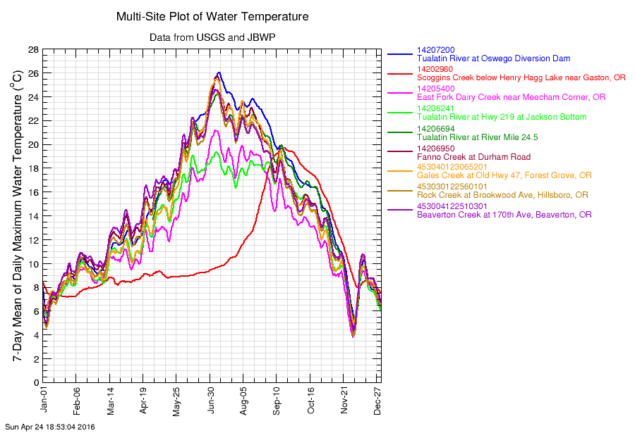
The Multi-Site Data Grapher plots a time-series graph for a single parameter from multiple sites. Here is an example of a multi-site plot of water temperature from nine different sites in the same river basin in Oregon:
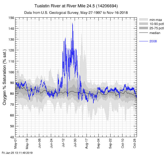
The Time-Series with Percentiles Data Grapher plots time-series data from one site with historical data percentiles. The 10th, 25th, 50th, 75th, and 90th percentiles of the available data are included in the graph along with the minimum and maximum, with or without data from user-selected years. Here is an example from a river in Oregon showing historical oxygen percent-saturation data from a 22-year period along with anomalous data from the summer of 2008:
Here is another example of a percentile plot, this time showing only the percentile data generated from a running average that corresponds to a local water-quality standard:
The Data Grapher By Year plots one time-series dataset from a single site against an X axis representing selected months, a calendar year, or a water year. Data from different years are plotted in different colors. Here is an example using a running average of daily maximum water temperatures from a site in Oregon for a full calendar year:
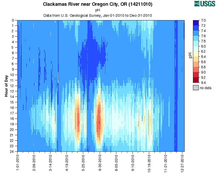
The Color Map Data Grapher plots one dataset as a color map, where the axes are either (a) date and time of day, or (b) year and day of year, and the data values are plotted as color blocks according to a user-specified color scale. Either the data value or the difference between the data value and a user-specified value can be plotted as a color. Here is an example of a color map of pH data showing daily variations on the Y axis and time on the X axis:
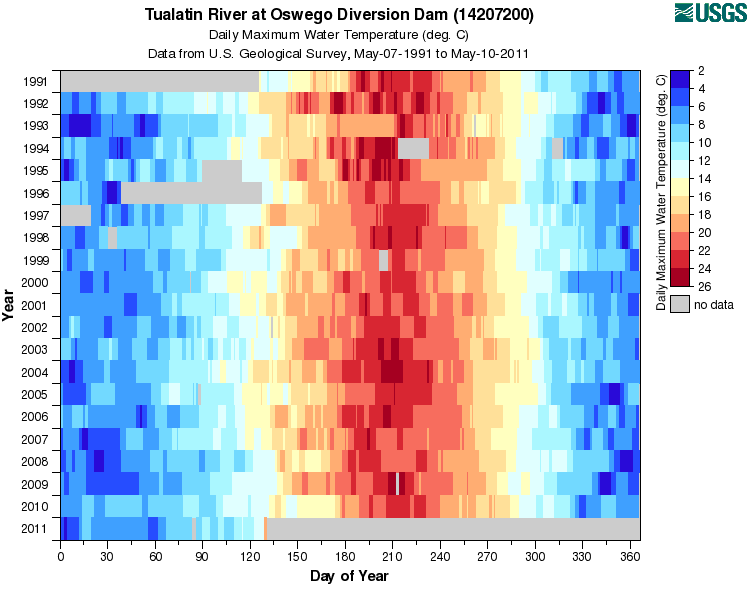
Here is another color map example showing daily maximum water temperature data as a function of year on the Y axis and day of year on the X axis:
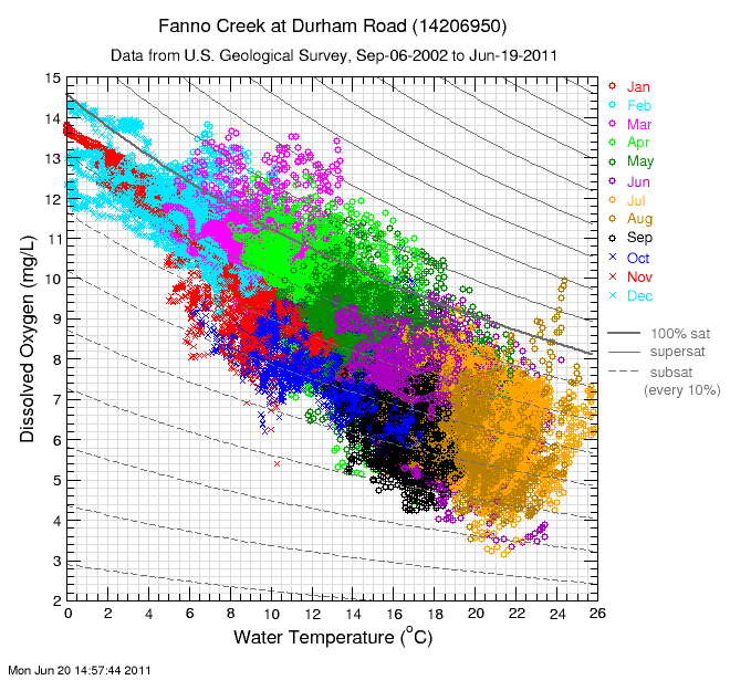
The Specialized XY Data Grapher allows the user to make XY graphs of one parameter versus another from one selected site and provides special features such as highlighting subsets of the data and plotting oxygen percent saturation contour lines on plots of dissolved oxygen versus water temperature. Here is an example of dissolved oxygen data plotted against water temperature from a site in Oregon, where the data are highlighted as a function of month and the plot contains contour lines of constant percent oxygen saturation:
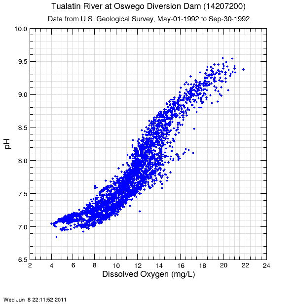
The original Data Grapher also can plot one time-series dataset against another from the same site as an XY graph. Here is an example of an XY graph of pH versus dissolved oxygen concentration from a site in Oregon:
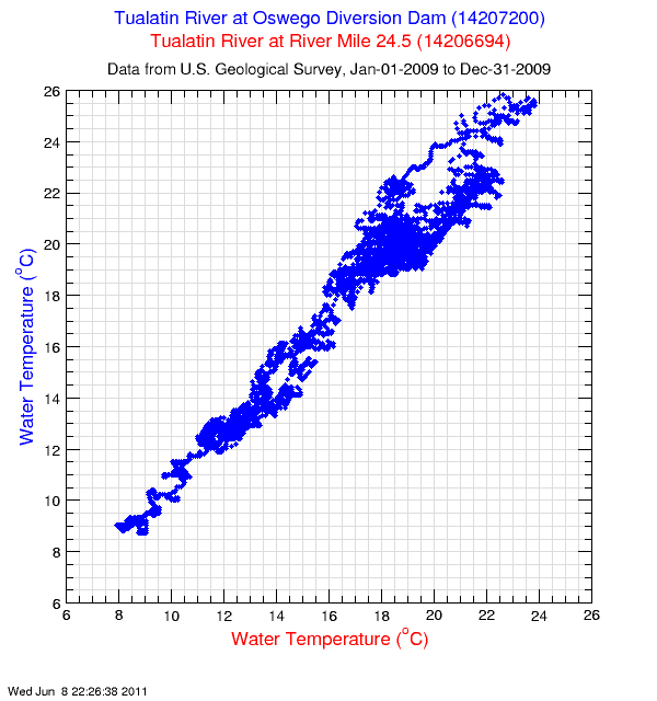
The Two-Site Data Grapher can plot one time-series dataset against another as an XY graph, and the datasets can come from different sites. Here is an example of water temperature from one site plotted against water temperature from an upstream site on the same river in Oregon:
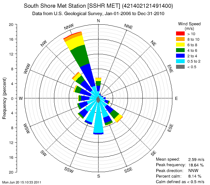
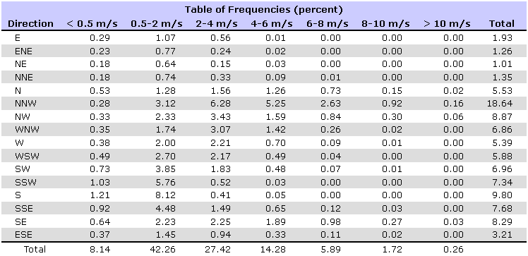
The Wind Rose Data Grapher allows the user to construct wind-rose diagrams for sites with wind-speed and wind-direction data. A wind rose is essentially a frequency histogram of wind speed data in polar coordinates that correspond to the wind direction. The user has the option to separate the data by the magnitude of the wind speed, and to create plots only for data from certain months and/or times of the day. Summary statistics and a table of frequencies are produced along with the wind rose diagram. Here is an example from a meteorological site near Klamath Falls, Oregon:
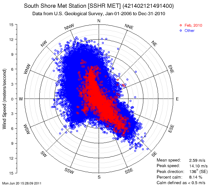
The Wind Rose Data Grapher also allows users to create wind-speed / wind-direction plots in polar coordinates where the magnitude of the wind speed is plotted as the distance from the origin and the wind speed is the angle around the circle. This is not the same as a wind rose, but can be useful for examining patterns in the data. Specific time periods can be pulled out and highlighted in different colors. Here is an example of a wind speed/direction plot showing four years of data, but highlighting the data from one month in one particular year:
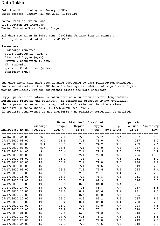
The Data Tabler allows users to construct customized tables of time-series data from a single site. The original measurements or daily statistics can be tabled. Oxygen percent saturation can be computed for sites having dissolved oxygen and water-temperature data. Here is an example data table from a site in Oregon:
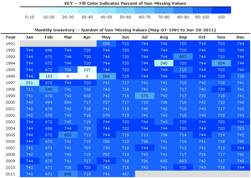
The Data Grapher Inventory Table program allows the user to quickly examine the availability of data in the Data Grapher system as a function of month and year, or day and month and year. Here is an example of a monthly inventory of water-temperature data from a site in Oregon having 20 years of data:
![]() U.S. Department of the Interior |
U.S. Geological Survey
U.S. Department of the Interior |
U.S. Geological Survey
URL: https://or.water.usgs.gov/grapher/tutorial/examples.html
Page Contact Information: Stewart Rounds
Page Last Modified: Tuesday - Jan 29, 2019 at 14:50:24 EST
